Colors
Colors in a document can be powerful. In addition, color is no longer the rich-man option, especially since color printing has become cheap with continuous ink supply systems.
However, my advice is to use color cautiously. Often I see documents that use colors as make-up (and I literally mean, the things people put on their own face). Using colors as beautification is ok, until it starts to get confusing.
Legends
Take a look at the graphs below. Take a look at the legends and compare them. How difficult can life be made? I generated these figures myself, but in line with an example I found in a PhD thesis.
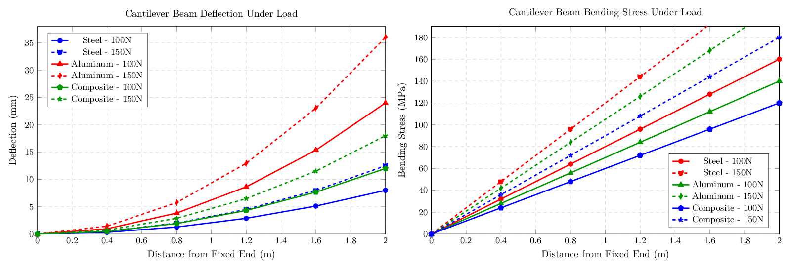
Deflection measurements of different materials
So, if you have consistent data sets over multiple graphs, keep the encoding consistent!
Coloring objects
These are a few figures, I generated with ChatGPT 5 in TikZ format. Let's be honest. They look lousy. I'd do a far better job myself (and in less time). I must confess further: ChatGPT used consistent colors, I had to change them in order for me to mimick the images I saw a scientific text earlier today. These are example of inconsistent color usage: first green for the input, blue of the intermediate layers and red for the output:
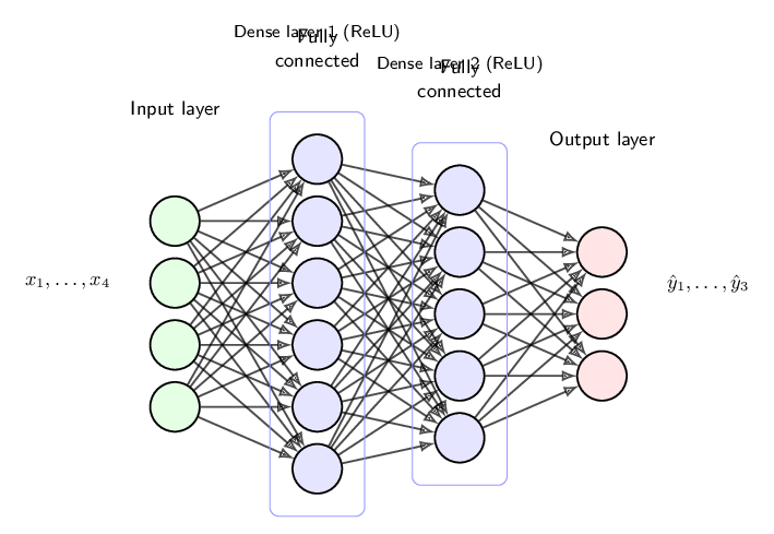
A deep neural network
And then, blue for the input, red for the intermediate layer and green for the output... confusing!

A single neuron of the network
So my advice is: be cautious with color. Maybe you'd better stick with a single support color instead of making a childish coloring book of your precious scientific work.